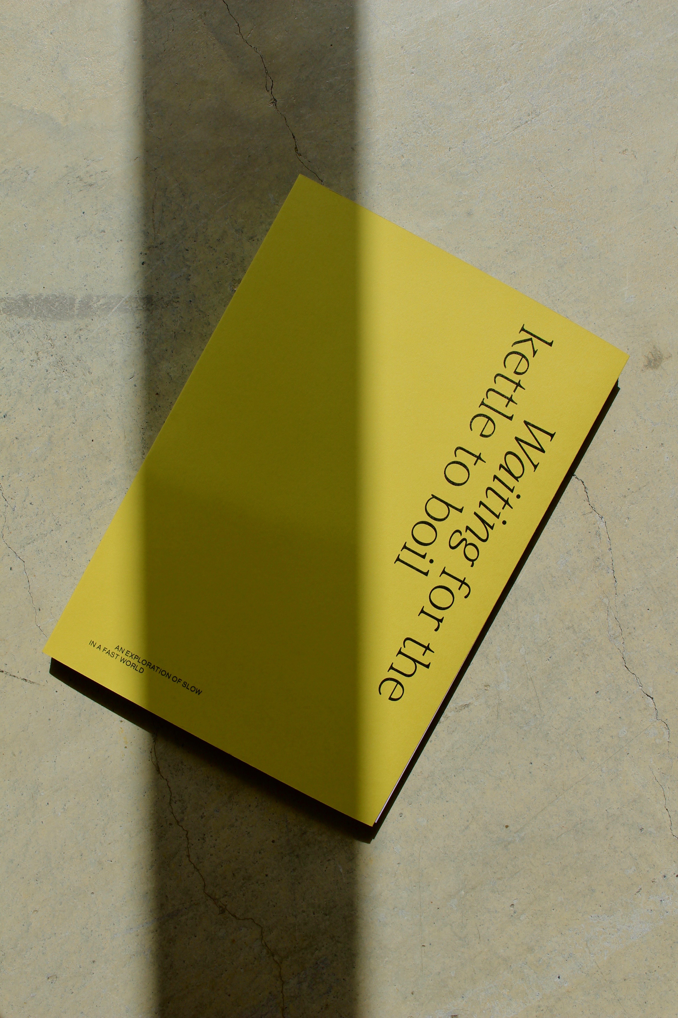

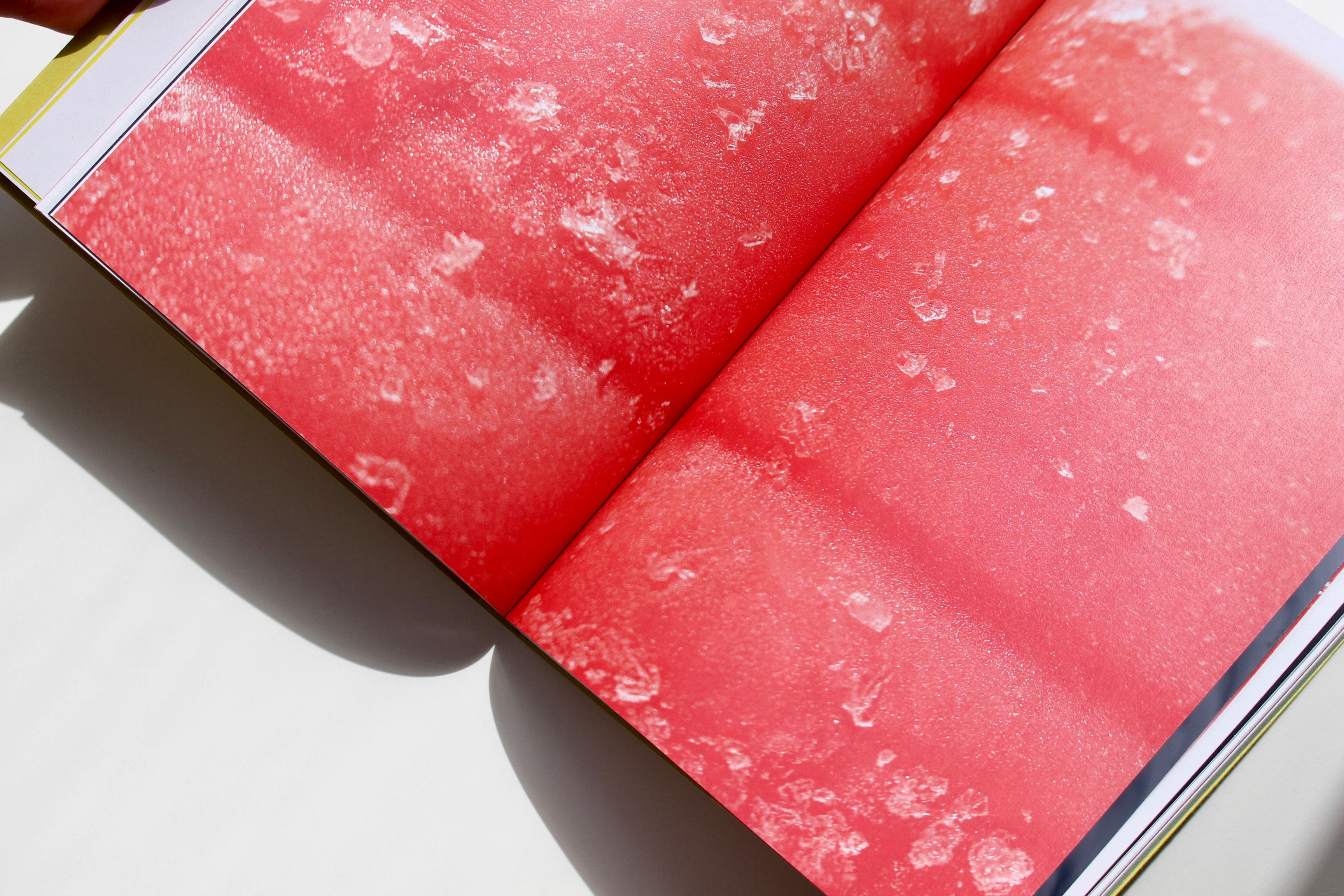

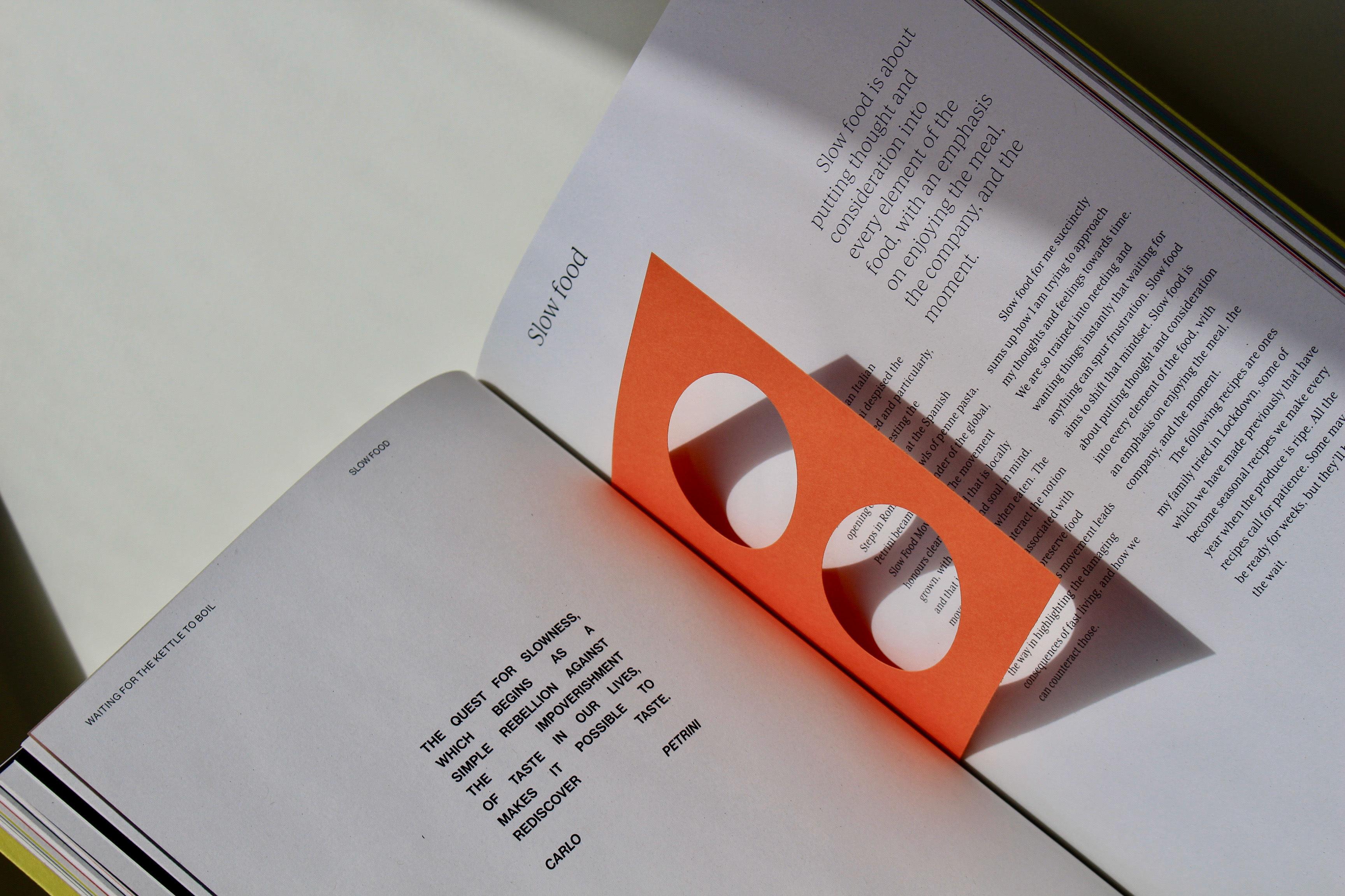

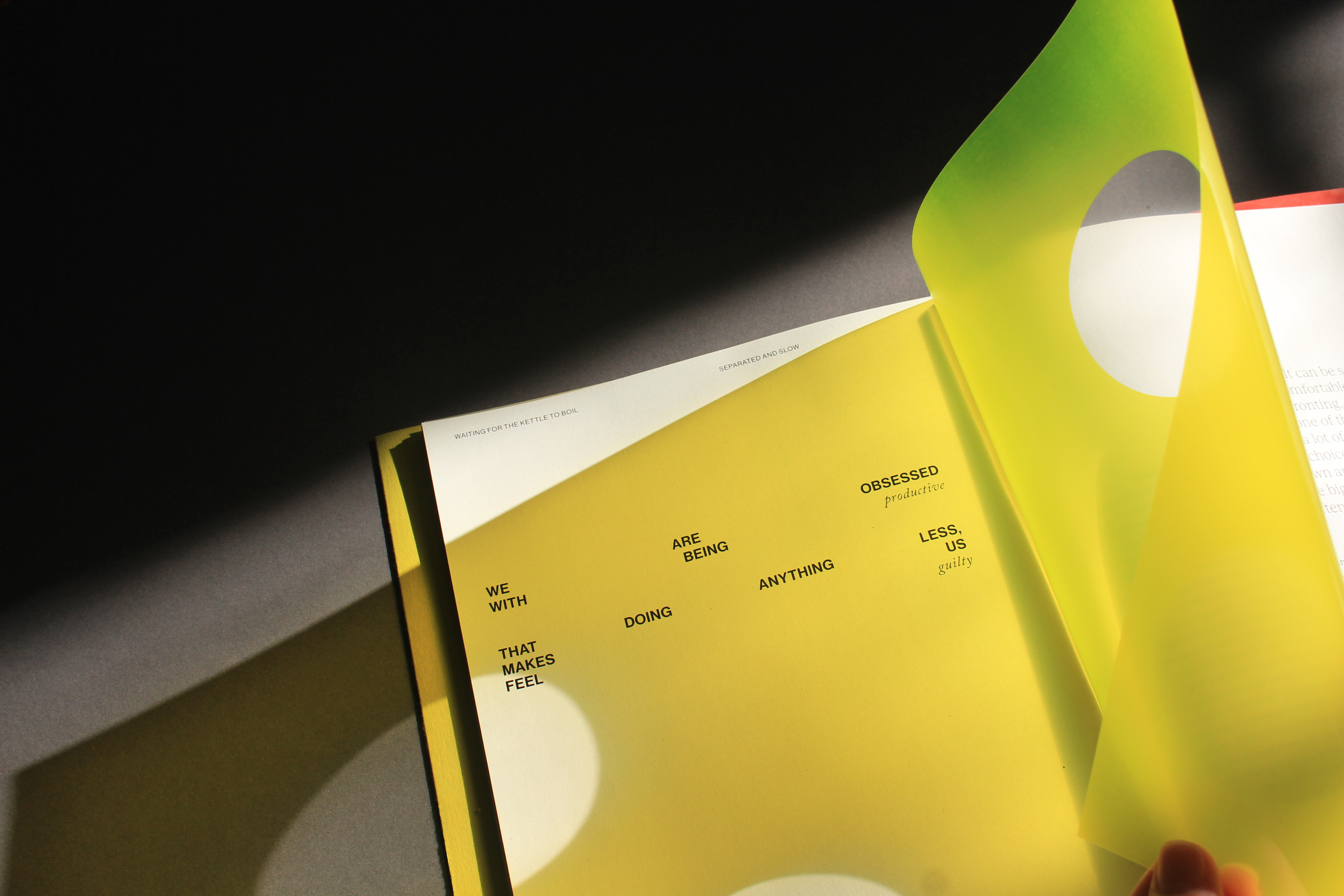
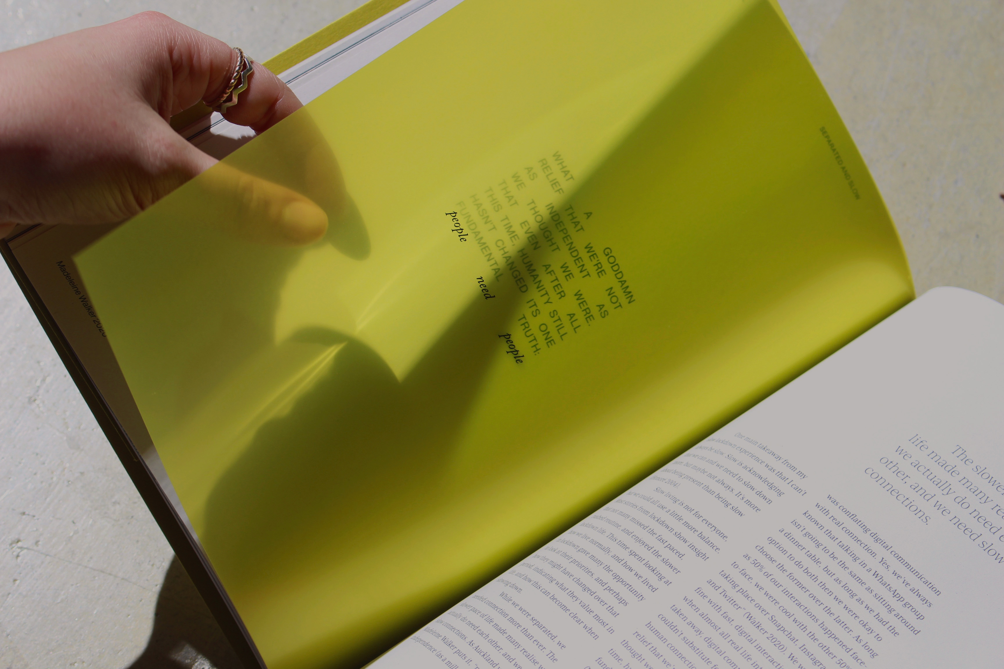
A tactile, poetic publication that explores slowness in a fast world. Through personal experience, the book explores the good, the challenging, and the vulnerable nature of slowing down when the world is urging you to speed up. Through typographic pacing, tactility, and interactive moments, the book encourages the reader to take their time, allowing a slow read and a quiet moment.
{4th Year Honours Project 2020}
Bronze Best Award 2021, view here

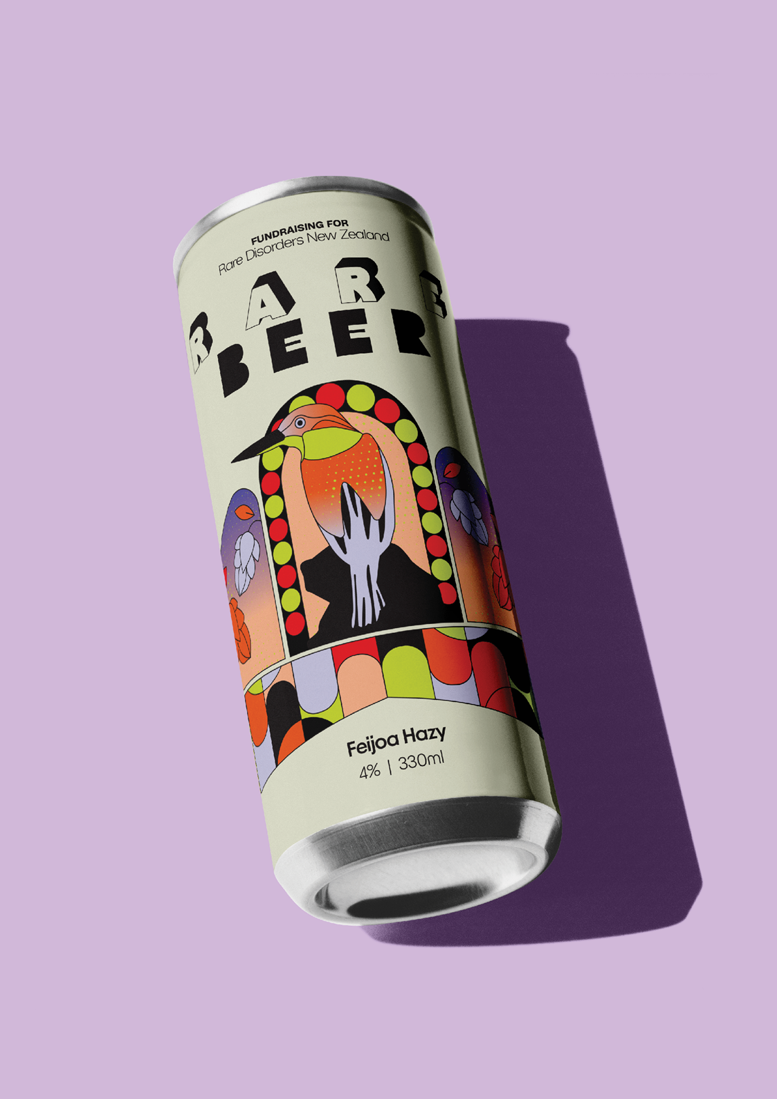
Rare Beer
The Rare Beer fundraiser invites local Wellington breweries to develop and brew a beer with rare ingredients in support of Rare Disorders New Zealand.
{2023}
Concept developed at Star Group

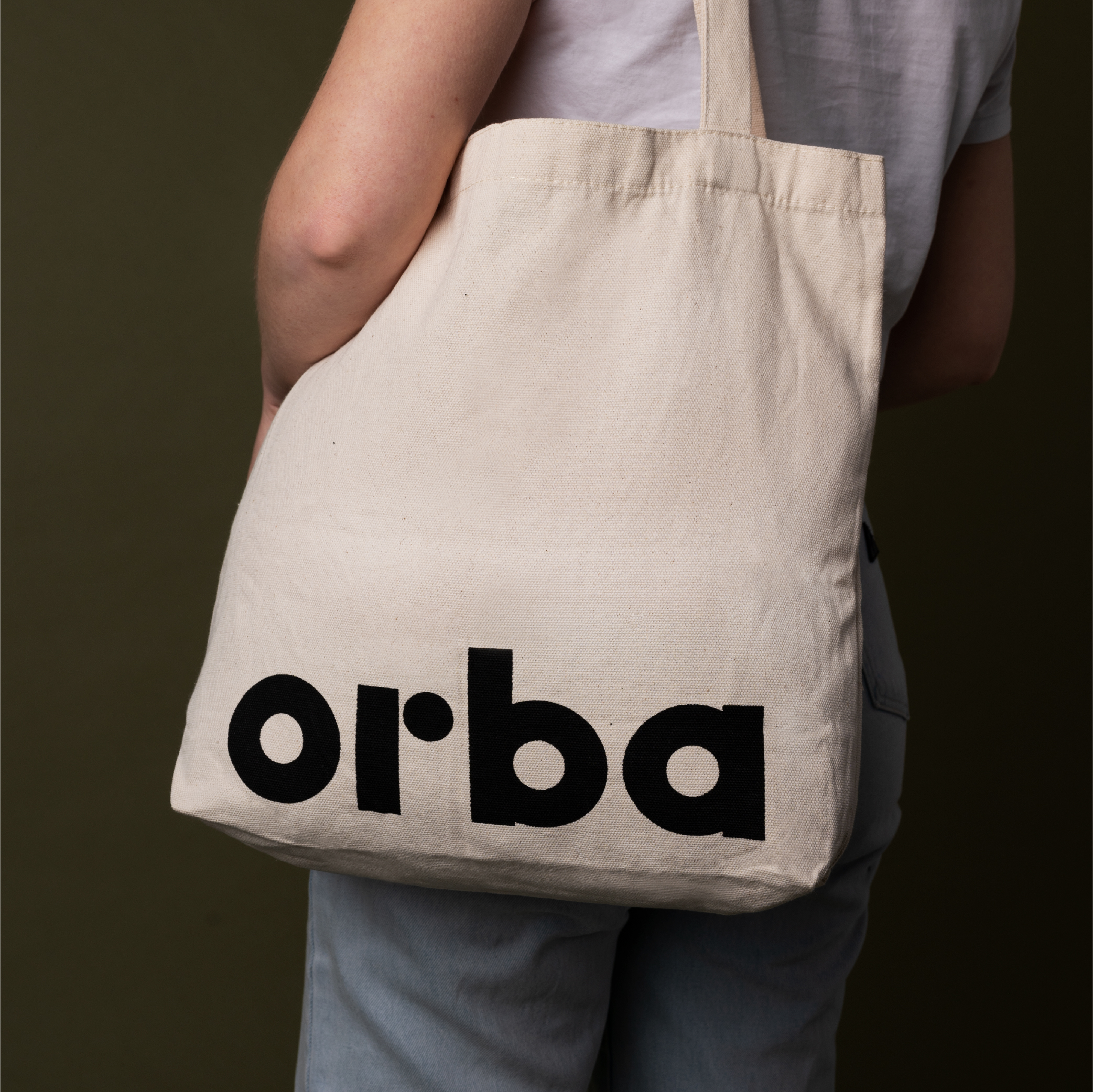

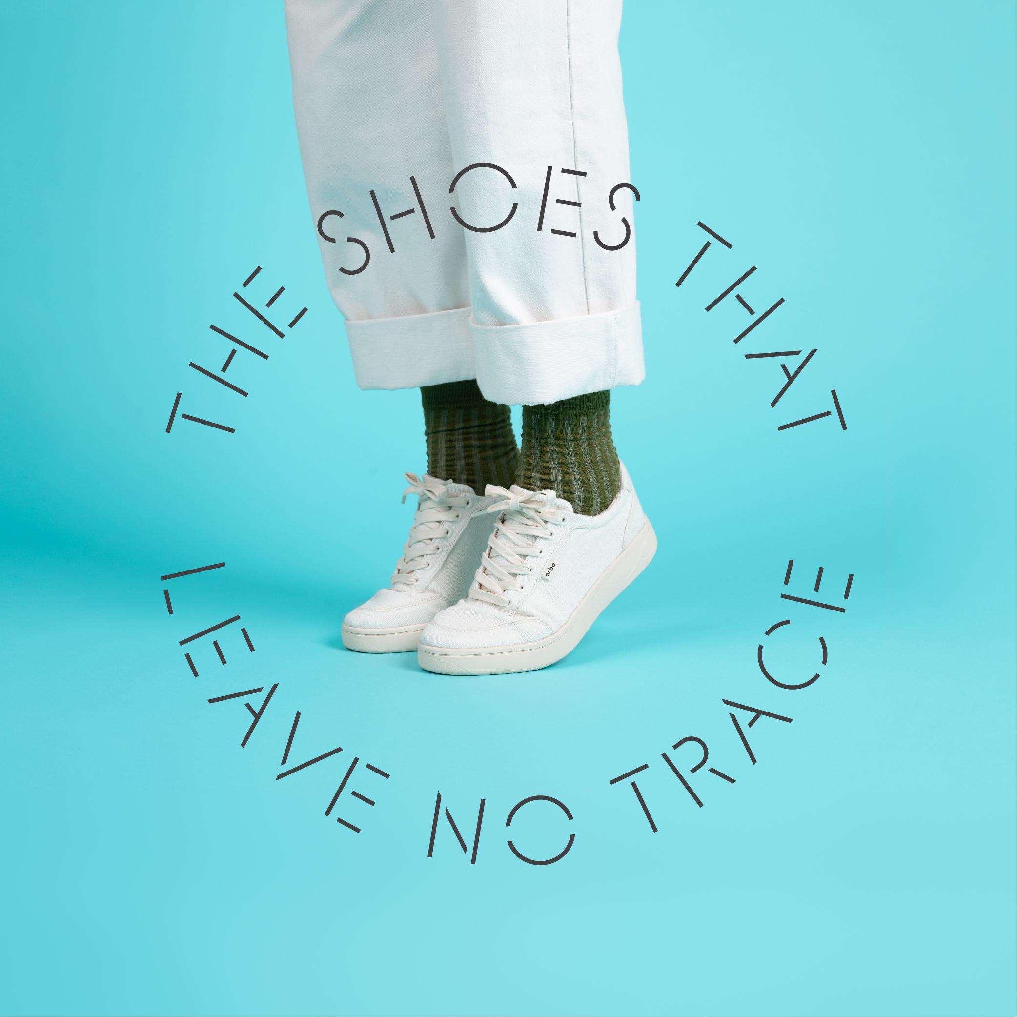

Orba
Brand identity for a sneaker startup with a focus on circularity. Orba shoes are made from renewable plant-based materials.
{2021}
Project completed at Foundry Creative

Unit 7
Identity and material for UNIT 7, a boutique architecture practice specialising in commercial and heritage spaces.
{2021}
Project completed at Foundry Creative

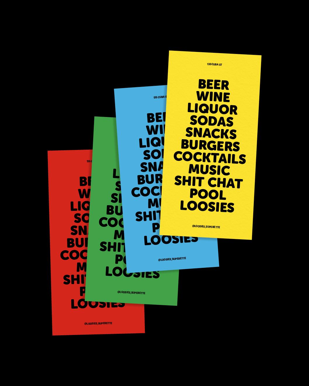
Loosies Superette
{2023}
Project completed at Star Group
Photography by Video Taxi

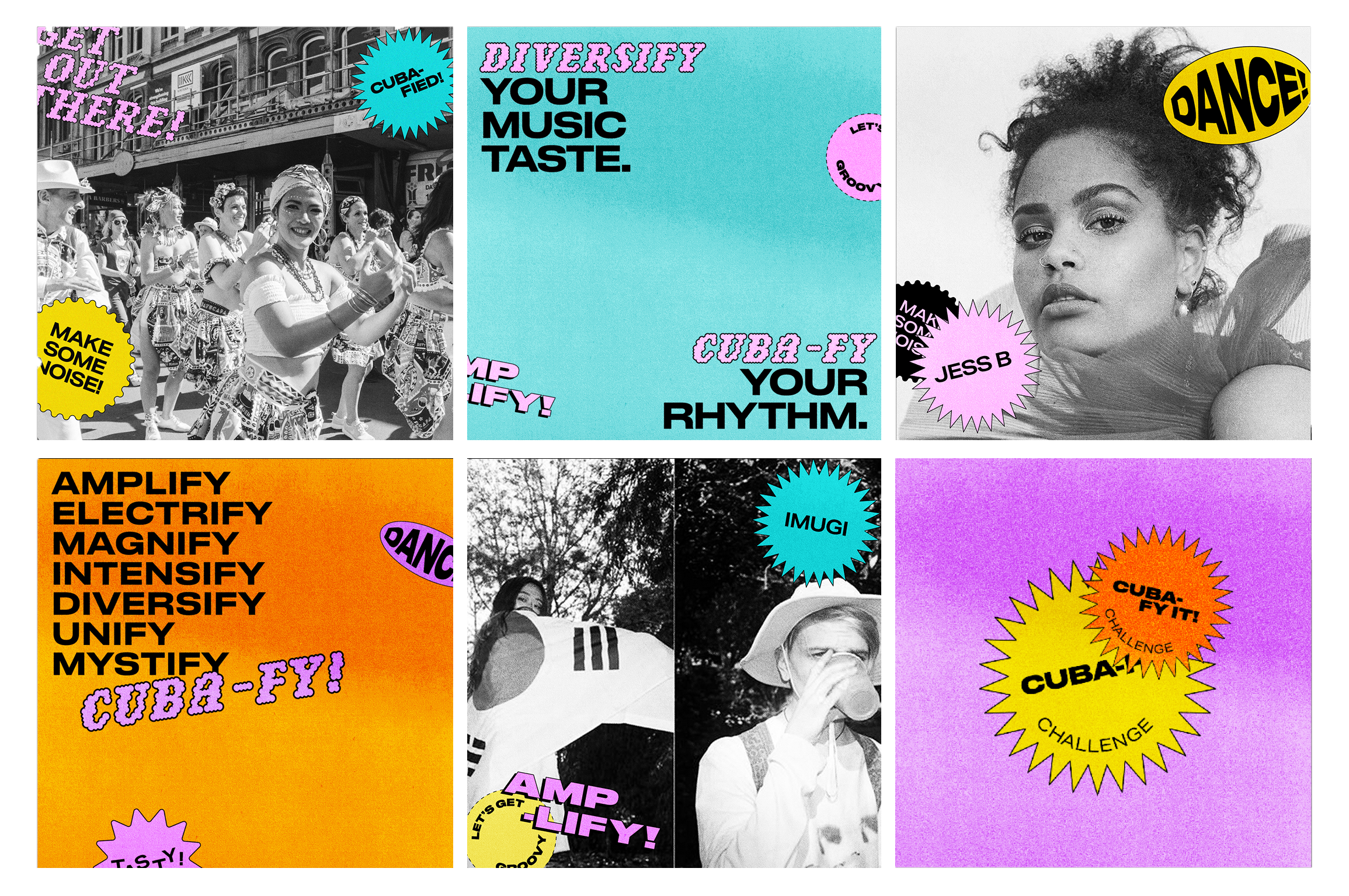

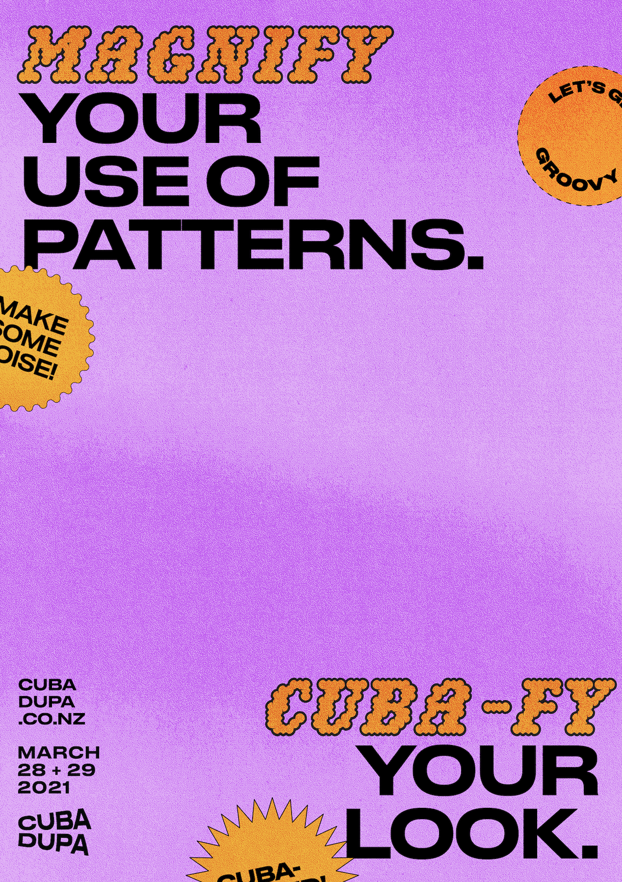
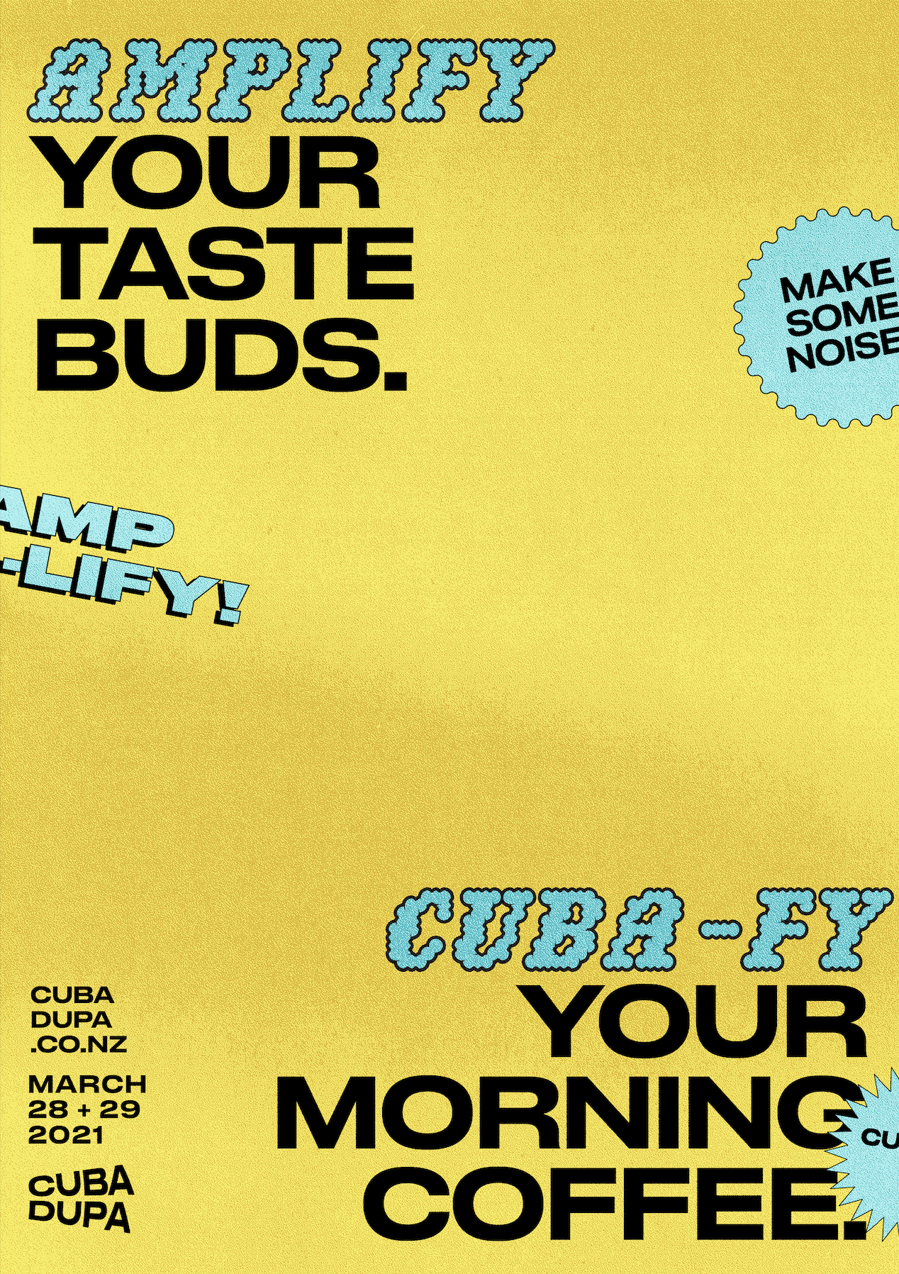
The rebranding of Wellington's CubaDupa festival aimed to "Cuba-fy the everyday”. Inspired by the eclectic charm of Cuba Street and its vibrant culture, to “cuba-fy” something is to make it quirky, daring, and flavourful.
{2020}


Visa Wellington On A Plate
Burger booklet for 29 submissions to Visa Wellington On A Plate festival and competition. Completed art direction and photoshoots for each themed submission.
{2023}
Project completed at Star Group
Gorilla Burger
Bringing each Gorilla Burger on the menu to life with an individual lockup and personality.
{2023}
Project completed at Star Group

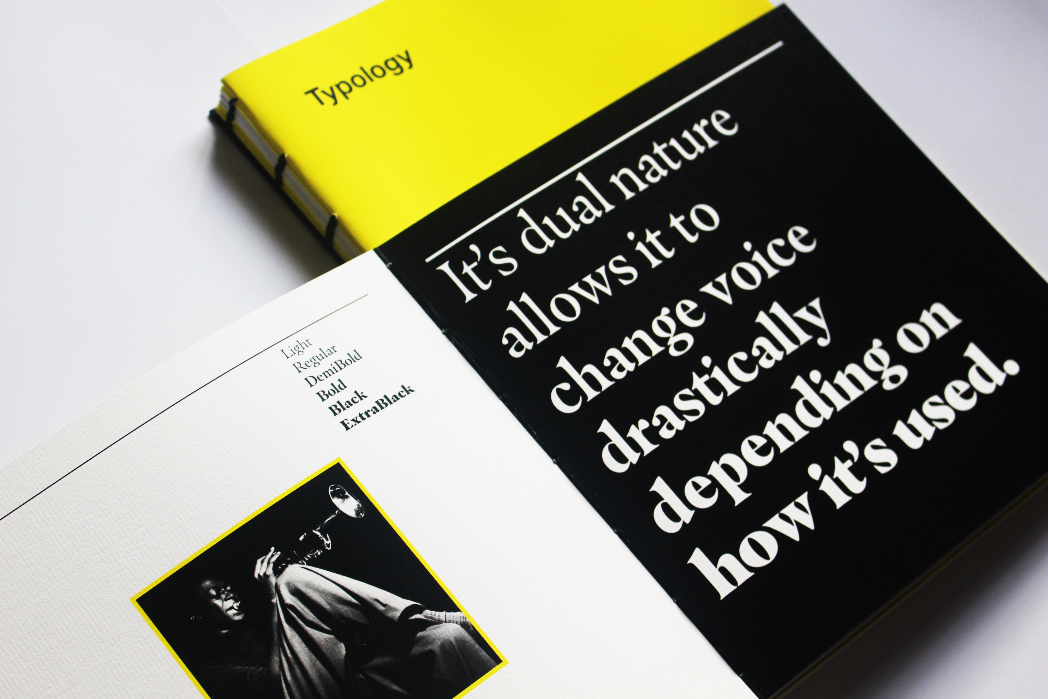

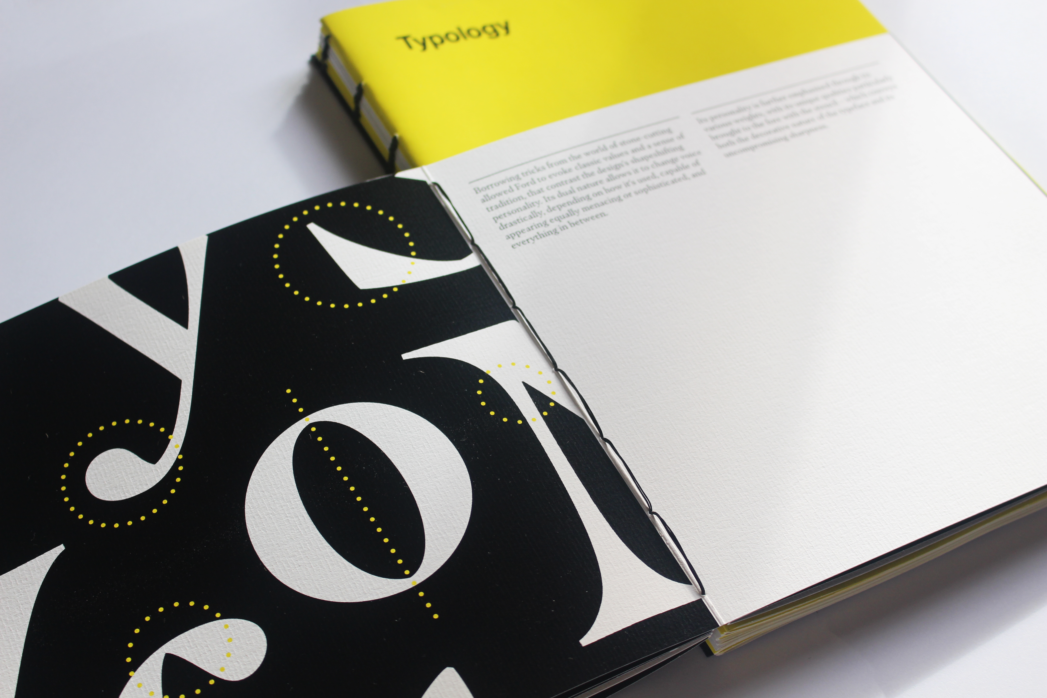
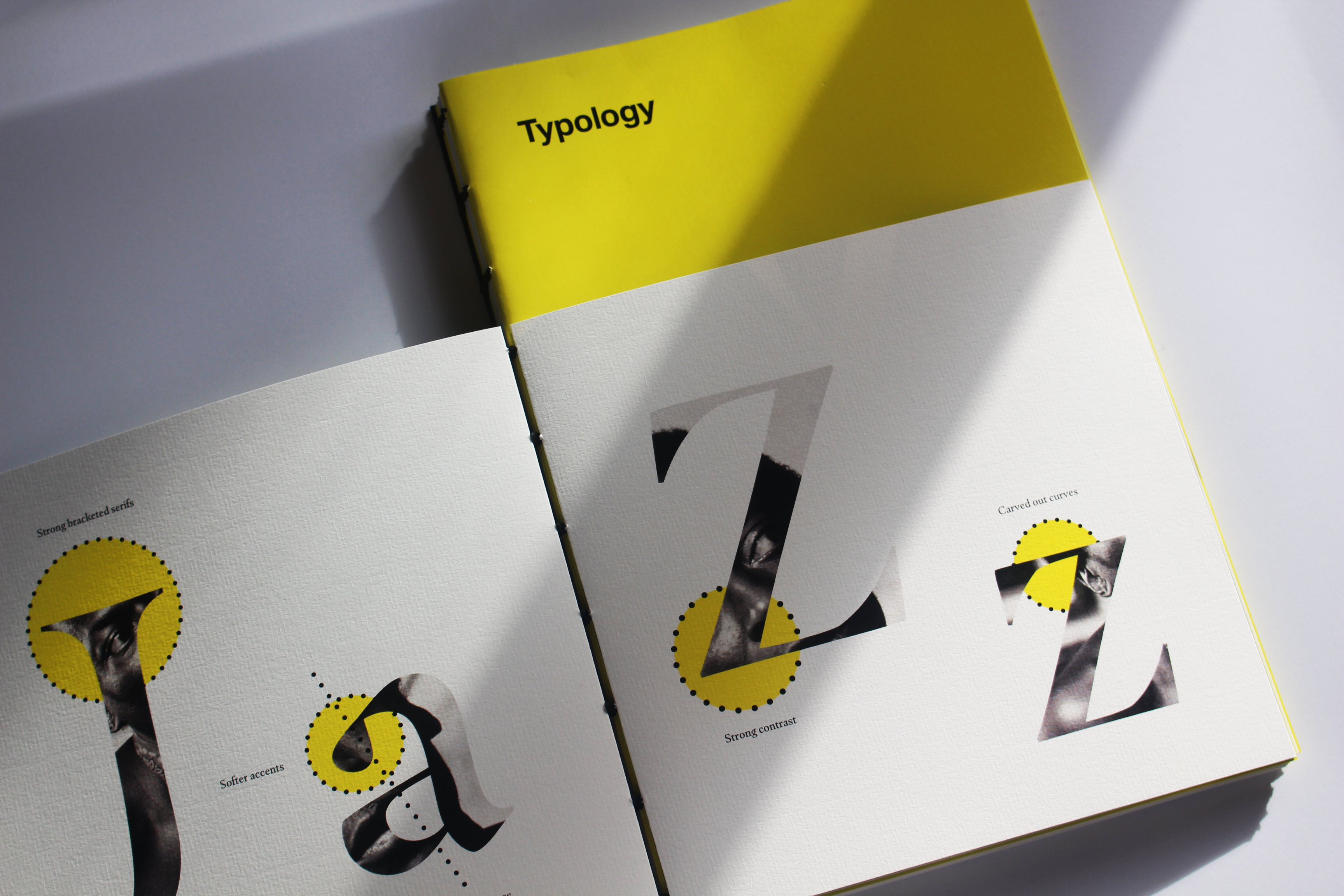
Hand bound coptic stitched book. The classification of typefaces, and Masqualero type specimen. The Masqualero specimen explores the design of a serif typeface that was inspired by the influential music of Miles Davis.
{2019}

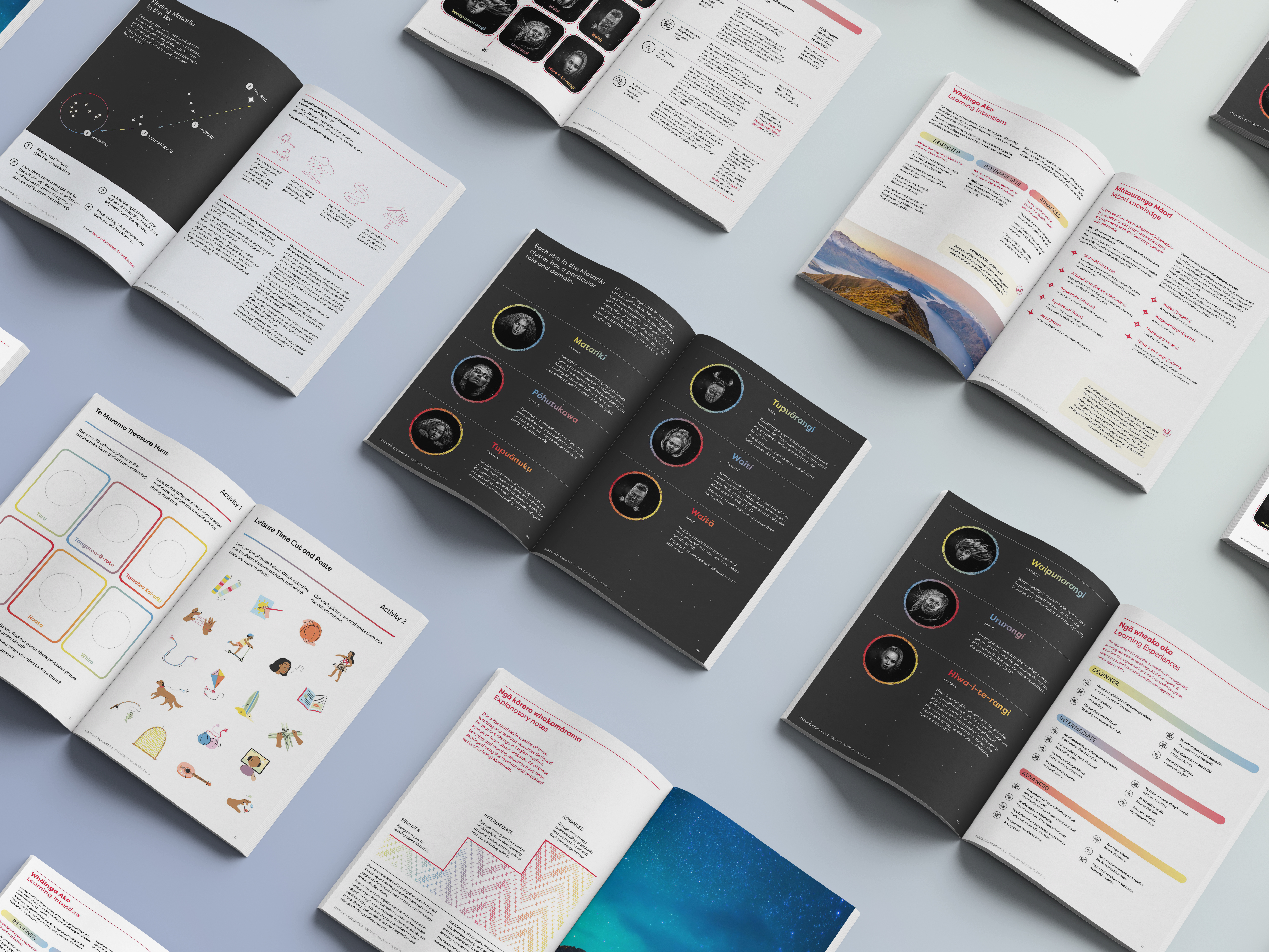
Mānawatia a Matariki
Resource with activities designed to support teachers to help students explore Matariki by asking What is Matariki? Who are the stars of the Matariki cluster? and How can we celebrate Matariki?
Matariki is the Māori name for the cluster of stars, that rises in midwinter and for many Māori, heralds the start of the new year.
{2022}
Designed for the Ministry of Education New Zealand.
Project completed at Foundry Creative
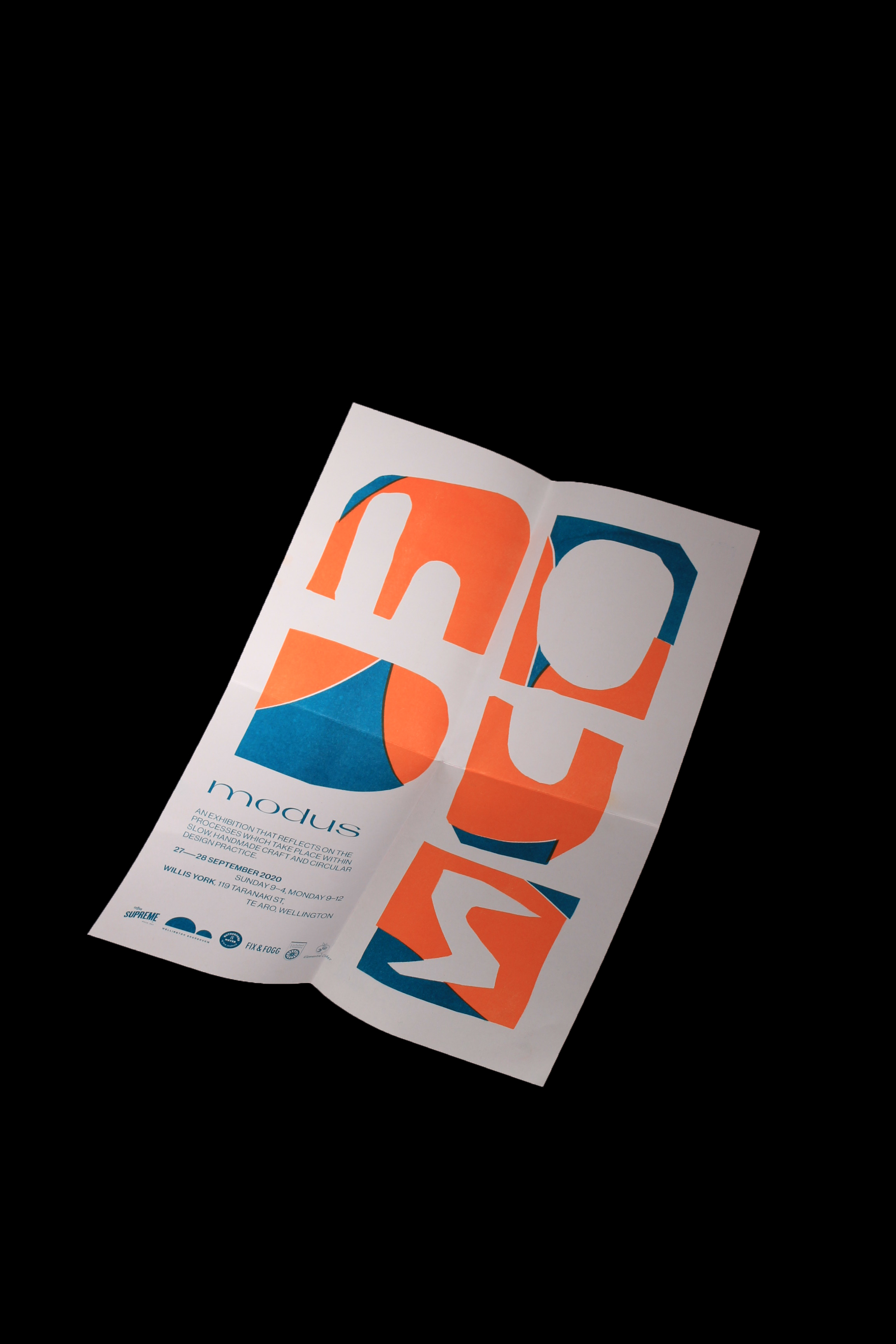
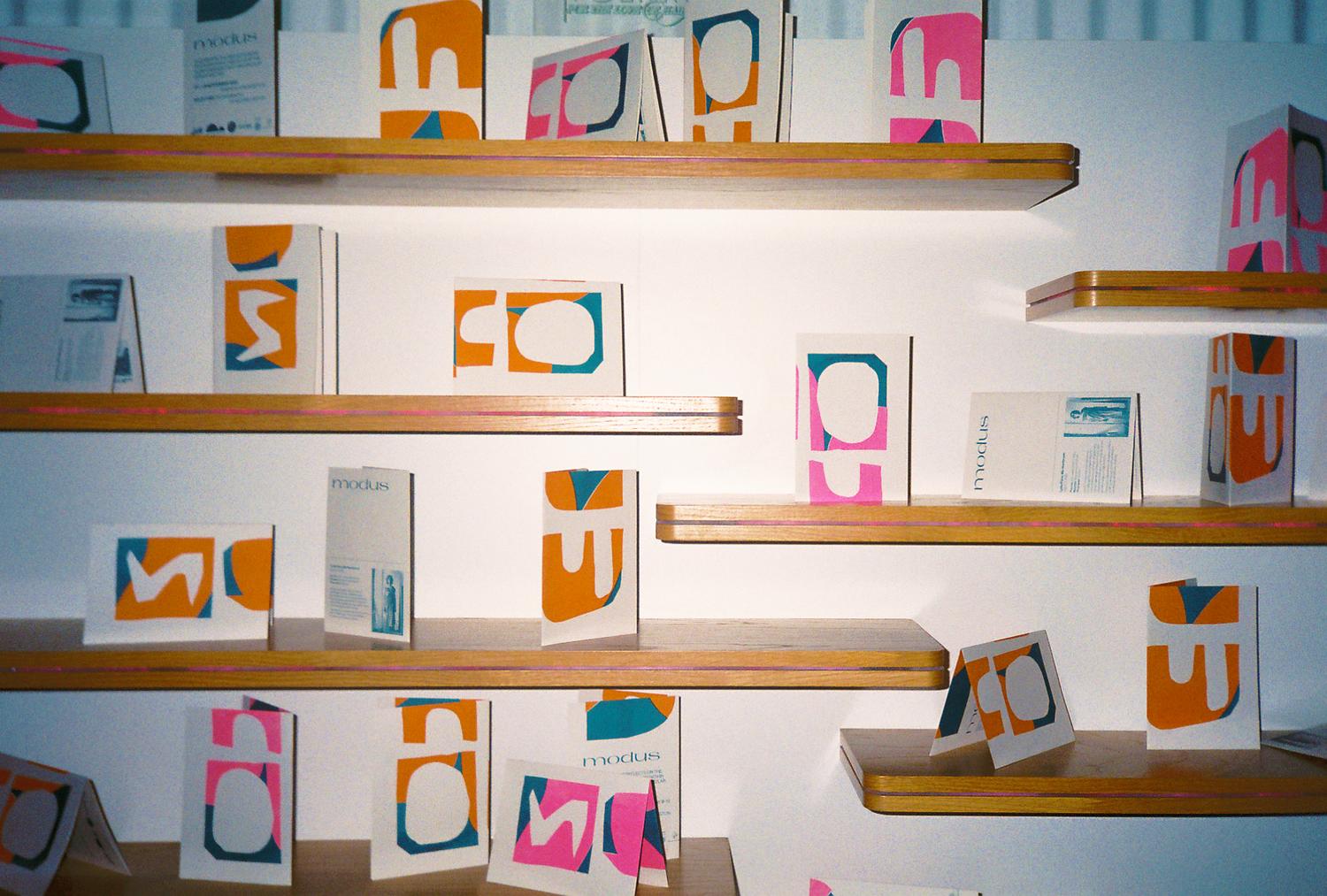
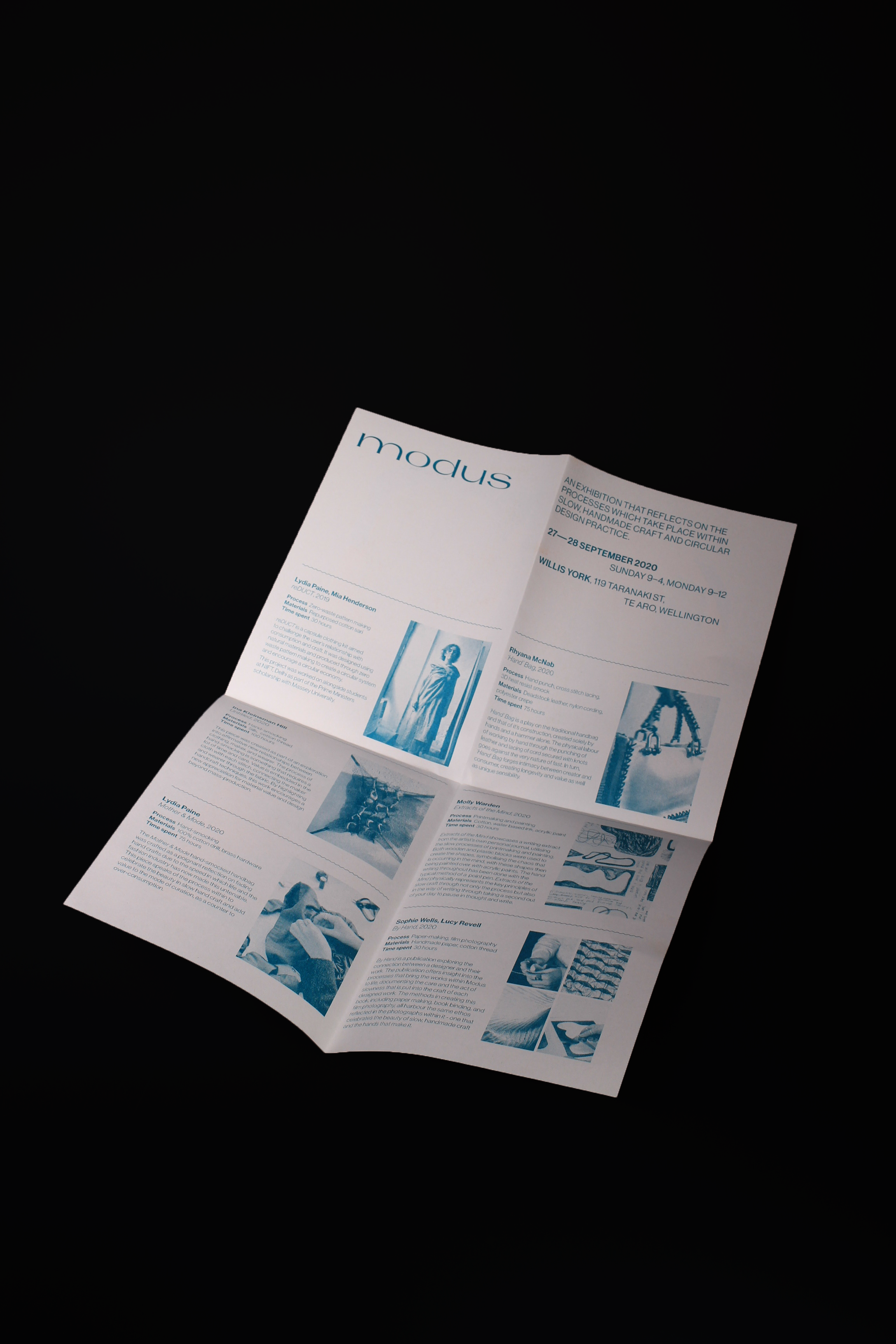
Modus
An exhibition that explores themes of circularity and slow design practices. The ephemera was printed on a risograph printer, celebrating slow design and craft.
{2020}